SSmith Designs
Sunday, October 11, 2020
About the Brand: SSmith Designs
Every designer needs a good logo to identify themselves by. For me, its the Diamond S. But what does it mean? And how did it become my logo?
The logo replaced a rather crude earlier version, and has gone through a few adjustments as well. The colors of gray and silver are meant to be a flexible look, providing a clean and modern foundation. The touches of turquoise are meant to represent a spark of inspiration, the basis of design. The diamond that surrounds the S is meant to reflect ties to quality (a diamond is often times the standard for quality due to its value). The center S is made up of 2 J shapes representing my initials of SJS. The "S" is slanted upward to represent to climb to continuously get better and improve, as a creator always should. The brand as a whole is designed to be flexible, being able to be used with a variety of colors, designs, and patterns depending on the event and idea that best reflects the current moment. This logo has also been featured in a Gray/White/Turquoise and Gray/White coloring, as well as a simple "Chrome" style, to name a few.
Allow Me to Re-Introduce Myself...
It's hard to belive that it's been over two years since I last posted here. Lots of things have changed, for better and worse, and I'm here to hopefully restart a blog that needs new life!
My name is Stephen Smith. I'm a native Coloradan, but I am currently attending the University of Nebraska as a freshman. For most of my life I have always been involved in sports, whether it be basketball, soccer, or football. I am a pop culture nut especially in the world of Star Wars, Marvel, Disney, Destiny, and Assassin's Creed, and I am an avid historian and video games.
I have also been involved in sports design for around 8 years now. I have developed my skills and over the past year I have grown my platform from a small time poster on a sports design forum, to creating TikToks that gathered thousands of likes (my most liked video had over 10000+ likes and 168,000 views), and having my work featured on websites such as sportslogos.net and Yahoo! Sports. I currently run a small Instgram page with around 160 followers, but I am always looking to grow that number! I do work from pop culture mashups, to professional league redesigns, and everything in between. I currently use Inkscape as my main medium, but I am looking to soon expand into photoshop and illustrator to expand my portfolio.
On this blog I will post concepts, design reviews, updates, and other things related to sports design. If you ever have any requests or questions, message me on instagram @ssmith_designs.
Welcome to the reboot of SSmith Designs! Enjoy the ride!
Wednesday, June 27, 2018
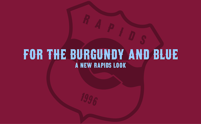
A Refreshed Colorado Rapids
The Colorado Rapids, as of Summer 2018, are in a bad place. Low attendance, poor play despite the signing of multiple international players and Tim Howard, and even a USOC bow-out to Nashville FC have marred the team throughout 2018.
Their brand is somewhat bland too. Granted, it is unique amongst the MLS field, but they have seemed to distance themselves from Arsenal, who they were a development team too, connected by the Kroenkes, even abandoning the familiar white sleeves. The crest itself is very dated and unnecessarily busy and definitely needs an update.
The rebrand I attempted tried to create a more local focus, as well as cleaning up and simplifying the Rapids look. So, let's get started.
The third kit is more representative of recent away kits. Displaying colors of the Colorado flag, the kits is yellow-blue-yellow with a yellow to blue gradient of the shirt and red trimmings.
Their brand is somewhat bland too. Granted, it is unique amongst the MLS field, but they have seemed to distance themselves from Arsenal, who they were a development team too, connected by the Kroenkes, even abandoning the familiar white sleeves. The crest itself is very dated and unnecessarily busy and definitely needs an update.
The rebrand I attempted tried to create a more local focus, as well as cleaning up and simplifying the Rapids look. So, let's get started.
The home kit has sleeves echoing the Colorado flag and is paired with white shorts and burgundy socks.
The away kit is all blue, reflecting road kits of the past. A wave pattern is sublimated into the fabric, representing the Rapids name.
And here is some merch to end it off.
Well, that is it for now. If you have any suggestions feel free to comment or email me.
I have some other series coming up that I think you will like, so stay tuned.
Welcome
Welcome to my page! I am a hobby sports designer looking for a bigger platform. Here I will post some of my work and ongoing projects. You can also find me on the CCSLC boards as SSmith48. I will post when I can, so be on the lookout for new posts.
Here's to the adventure!
Here's to the adventure!
Subscribe to:
Comments (Atom)


